

Harvest Home Assisted Living
-
Harvest Home Assisted Living is an assisted living that is dedicated to caring for the elderly and encouraging them to live with purpose & grace. With a firm foundation, they faced a crossroads to grow. Southpaw was contacted for consultation and we diagnosed that we needed to rebrand the identity for a practical and meaningful experience.
Since the rebrand in 2018 and ongoing support with media and marketing, Harvest Home has gained the awareness, reputation and support it needed to allow to expand from 1 to 3 campuses throughout Wisconsin with full resident vacancy of 96 residents, and 120+ employees.
Client:
Harvest Home Assisted Living
Project:
+ Identity Design
+ Collateral Design
+ Digital Marekting
+ Video + Photo Production
+ Web Design + Build
January 2022 –

Inspired by the vintage.
To resonate with the residents and relate to their generation, inspiration was pulled from all of the “classic” ads and imagery that hold the foundational principles of design. Local Wisconsin heritage is what residents are familiar with, so with them being the target audience, it’s important to make them comfortable with that feel.


Country-Styled,
Christ-Centered.
Harvest Home’s servant-minded mission is based off Christian values and hold that as a core principle for their service to their residents, as well as their staff.
The logo illustrates this as the windmill in the field animates, then comes to a hault to align as a cross in the center of the icon. The “HH” monogram comes in to fill the space and compliment the weight for a cohesive mark.
The wordmark is inspired by that vintage type with decorative flair to draw the eye and relate to residents.


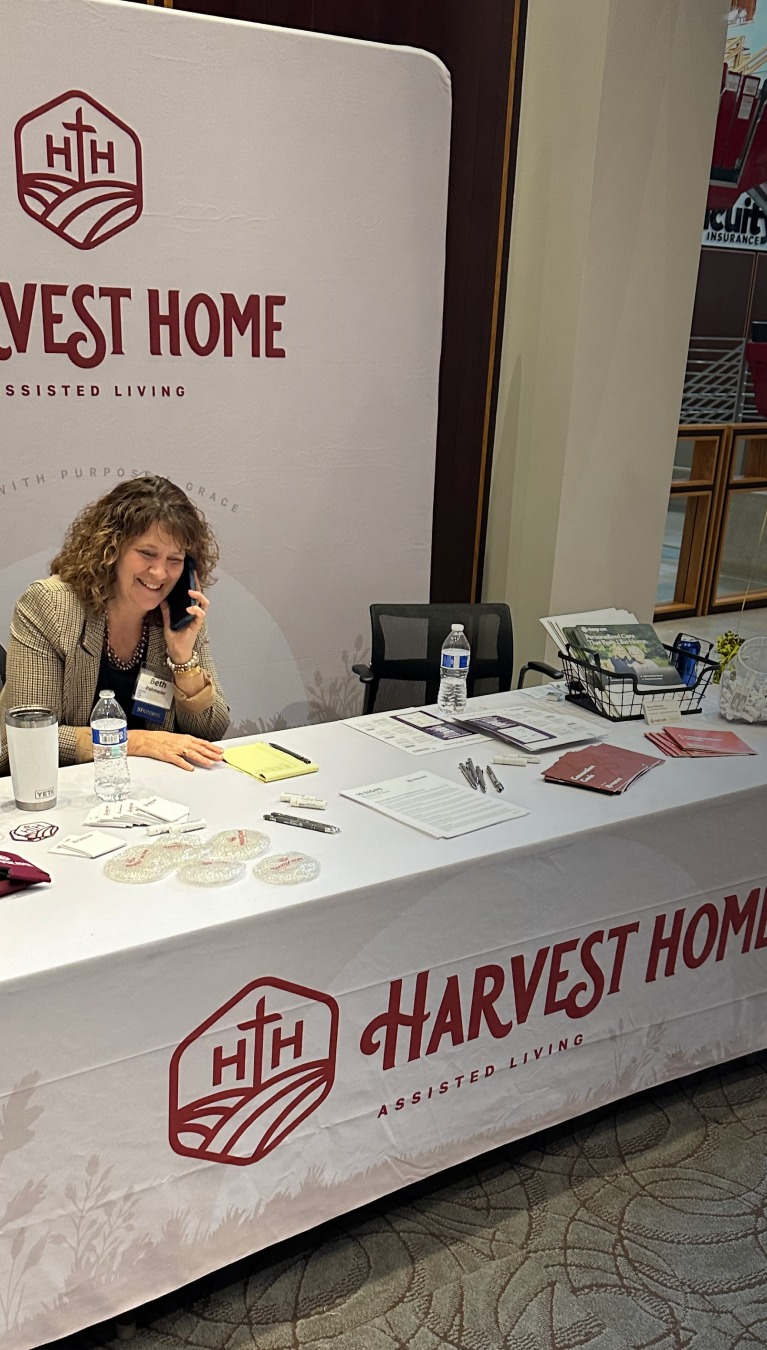

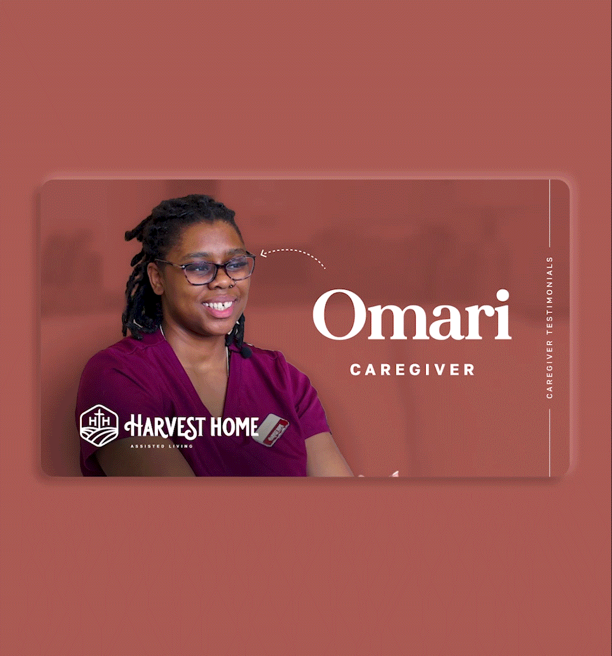

Marketing & Media
Fanning out the identity to the collateral is necessary to gain awareness with a consistent brand experience. It’s with media and how the voice comes through the marketing is just as important for Harvest Home to come across welcoming, comfortable, and reliable through its social media and digital channels.

